React の MUI (旧 Material UI) では、コンポーネントとして DataGrid が提供されていることから、グリッド表示したい時に便利です。
React Data Grid component - MUI
そんな中
const rows = [
  {
    id: 1,
    name: 'シナノドルチェ',
    purchaseDate: [new Date(2021, 8, 20)]
  },
  {
    id: 2,
    name: '秋映',
    purchaseDate: [new Date(2021, 9, 20), new Date(2021, 10, 10)]
  },
  {
    id: 3,
    name: 'シナノゴールド',
    purchaseDate: [new Date(2021, 9, 15), new Date(2021, 10, 10), new Date(2021, 10, 20)]
  },
  {
    id: 4,
    name: 'ふじ',
    purchaseDate: [null]
  }
]
な感じで、 purchaseDate に複数の日付を持つデータを MUI のDataGridに表示させたいことがありました。
そこで、色々試したときのメモを残します。
目次
- 環境
- やることやらないこと
- Vite.jsでReact環境を構築
- 開発環境で path alias (@) を使えるようにする
- 単数の値で DataGrid を表示
- 列の type を変更し、Date 型がどのように表示されるか確認
- 1列に複数の日付を持ったデータへ変更
- DataGridの valueFormatter と date-fns による書式設定
- DataGridの sortComparator にてソート機能を設定
- DataGridのfilterModelとonFilterModelChangeにより、フィルタ機能を設定
- ソースコード
環境
- React.js 17.0.2
- React Router 6.0.1
- @mui/core 5.0.0-alpha.53
- @mui/x-data-grid 5.0.0-beta.7
- date-fns 2.25.0
- TypeScript 4.4.4
- Vite.js 2.6.13
やることやらないこと
やること
- Vite.jsでReact環境を構築
- React Router 6系でルーティング
- MUI 5系のDataGridでデータを表示
やらないこと
Vite.jsでReact環境を構築
今回は react_mui_with_vite という名前のprojectで、TypeScriptを使って実装してきます。
% yarn create vite
yarn create v1.22.11
[1/4] 🔍  Resolving packages...
[2/4] 🚚  Fetching packages...
[3/4] 🔗  Linking dependencies...
[4/4] 🔨  Building fresh packages...
success Installed "create-vite@2.6.6" with binaries:
      - create-vite
      - cva
✔ Project name: … react_mui_with_vite
✔ Select a framework: › react
✔ Select a variant: › react-ts

Scaffolding project in path/to/dir

Done. Now run:

  cd react_mui_with_vite
  yarn
  yarn dev

✨  Done in 23.09s.
この記事では段階を追って動作の確認をしていきます。
そのため、各段階は別ページとして用意しておいたほうが分かりやすいことから、React Routerで各段階のページへ遷移できるようにします。
React Router | Installation
% yarn add history@5 react-router-dom@6
開発環境で path alias (@) を使えるようにする
このままDataGridの実装へ進んでもよいのですが、開発でよく使う機能を入れておきます。
まずはVite.js環境でも path alias を使えるようにします。今回は src 以下を @ で表せるようにします。
- alias '@' to path.resolve(__dirname, './src') is not working · Issue #279 · vitejs/vite
- resolve.alias - Configuring Vite | Vite
tsconfig.json
baseUrl と paths を指定します。
{
  "compilerOptions": {
    // ...
    "baseUrl": "./",
    "paths": {
      "@/*": ["./src/*"]
    }
  }
}
vite.config.ts
Node.jsの path を import しつつ、 resolve.alias を指定します。
まず、 path を使うために Node.jsの型情報を入れます。
% yarn add -D @types/node
続いて、 vite.config.ts に設定を行います。
なお、import は import * as path from 'path' とします。
TypeScript のモジュールのインポートには import を使う|まくろぐ
合わせて、開発サーバの起動ポートも 7110 に変更しておきます。
server.port - Configuring Vite | Vite
import {defineConfig} from 'vite'
import react from '@vitejs/plugin-react'
import * as path from 'path'

// https://vitejs.dev/config/
export default defineConfig({
  plugins: [react()],
  server: {
    port: 7110
  },
  resolve: {
    alias: [{find: '@', replacement: path.resolve(__dirname, 'src')}]
  }
})
これで path alias が使えるようになりました。
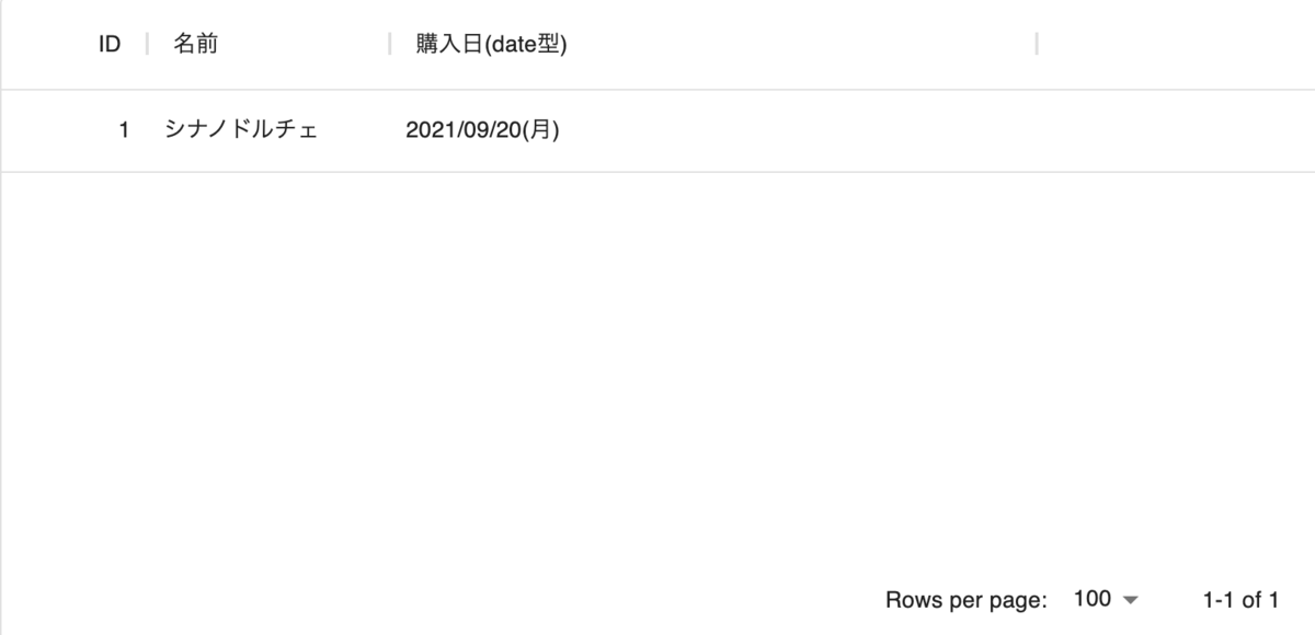
単数の値で DataGrid を表示
まずは、単数の値を持つデータをDataGridの列に表示してみます。
公式ドキュメントに従い、DataGridの本体と依存しているものをインストールをします。
Data Grid - Getting started - MUI
# 本体
% yarn add @mui/x-data-grid@next

# 依存
% yarn add @mui/material @mui/styles
続いて実装していきます。
まずは DataGrid を表示するページのコンポーネントを用意します。
src/components/pages/datagrid/DataGridBasic.tsx
import {Link} from 'react-router-dom'
import {DataGrid, GridColDef} from '@mui/x-data-grid'

const columns: GridColDef[] = [
  {field: 'id', headerName: 'ID', width: 90, type: 'number'},
  {field: 'name', headerName: '名前', width: 150, type: 'string'},
  {field: 'purchaseDate', headerName: '購入日', width: 300, type: 'date'}
]

const rows = [
  {
    id: 1,
    name: 'シナノドルチェ',
    purchaseDate: new Date(2021, 8, 20)
  },
  {
    id: 2,
    name: '秋映',
    purchaseDate: new Date(2021, 9, 15)
  },
  {
    id: 3,
    name: 'シナノゴールド',
    purchaseDate: new Date(2021, 10, 1)
  },
  {
    id: 4,
    name: 'ふじ',
    purchaseDate: null
  }
]

const Component = (): JSX.Element => {
  return (
    <>
      <nav>
        <Link to="/">Home</Link>
      </nav>
      <div style={{height: 400, width: '100%'}}>
        <DataGrid rows={rows} columns={columns} />
      </div>
    </>
  )
}
export default Component
続いて、このページへのルーティングを用意します。
src/main.tsx
import * as React from 'react'
import ReactDOM from 'react-dom'
import {BrowserRouter} from 'react-router-dom'
import App from './App'

ReactDOM.render(
  <React.StrictMode>
    <BrowserRouter>
      <App />
    </BrowserRouter>
  </React.StrictMode>,
  document.getElementById('root')
)
App.tsxに Routes と Route を実装します。
なお、以後はルーティングについては記載しませんが、適宜追加されていくものとします。
src/App.tsx
import * as React from 'react'
import {Route, Routes} from 'react-router-dom'
import DataGridBasic from '@/components/pages/datagrid/DataGridBasic'

function App() {
  return (
    <div className="App">
      <h1>Welcome to React Router!</h1>
      <Routes>
        <Route path="datagrid">
          <Route path="basic" element={<DataGridBasic />} />
        </Route>
      </Routes>
    </div>
  )
}

export default App
実装が終わったので起動してみたところ、エラーになりました。
% yarn run dev
...
node_modules/@mui/styled-engine/GlobalStyles/GlobalStyles.js:3:23: error: Could not resolve "@emotion/react" (mark it as external to exclude it from the bundle)
node_modules/@mui/styled-engine/StyledEngineProvider/StyledEngineProvider.js:3:30: error: Could not resolve "@emotion/react" (mark it as external to exclude it from the bundle)
node_modules/@mui/styled-engine/index.js:6:21: error: Could not resolve "@emotion/styled" (mark it as external to exclude it from the bundle)
node_modules/@mui/styled-engine/index.js:26:45: error: Could not resolve "@emotion/react" (mark it as external to exclude it from the bundle)
エラー対応のため、 package.json へ追記
MUIまわりで不足しているものがあるようなので、追加でインストールします。
Installation - MUI
今回はスタイリングはしないものの、 styled-component で実装することとします。
% yarn add @mui/material @mui/styled-engine-sc styled-components
styled-componentの場合、 @mui/styled-engine まわりの修正も必要そうなため、 package.json で dependencies と resolution を編集します。
@mui/styled-engine - MUI
なお、styled-componentのドキュメントによると、 styled-component に関しても resolution 設定をしておくようです。
Installation - styled-components: Basics
  "dependencies": {
    "@mui/styled-engine": "npm:@mui/styled-engine-sc@latest",
  // ...
  },
  "resolutions": {
    "@mui/styled-engine": "npm:@mui/styled-engine-sc@latest",
    "styled-components": "^5"
  }
もう一度 yarn してから yarn run dev で起動し、 http://localhost:7110/datagrid/basic へアクセスするとDataGridが表示されました。

列の type を変更し、Date 型がどのように表示されるか確認
先ほどの列定義は
{field: 'purchaseDate', headerName: '購入日', width: 300, type: 'date'}
でした。
ただ、DataGridでは列の type はいくつか指定できるようです。
Column types - Data Grid - Columns - MUI
そこで
- date
- datetime
- string
の違いを試してみます。
列定義を
const columns: GridColDef[] = [
  {field: 'id', headerName: 'ID', width: 90, type: 'number'},
  {field: 'name', headerName: '名前', width: 150, type: 'string'},
  {field: 'purchaseDate1', headerName: '購入日(date型)', width: 150, type: 'date'},
  {field: 'purchaseDate2', headerName: '購入日(dateTime型)', width: 200, type: 'dateTime'},
  {field: 'purchaseDate3', headerName: '購入日(string型)', width: 400, type: 'string'}
]
と変更した DataGrid のコンポーネント DataGridColumnTypes.tsx を用意し、表示してみます。
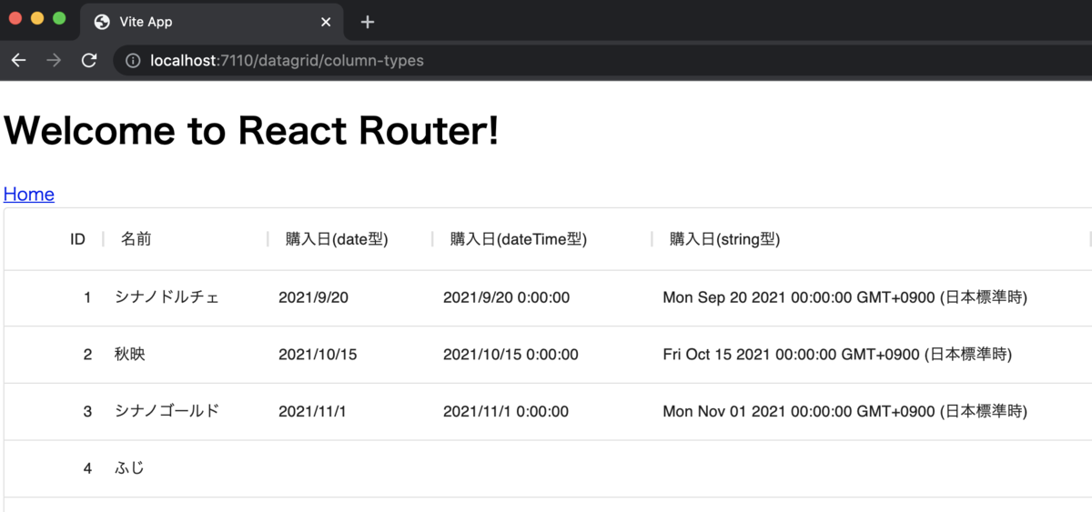
type ごとに表示形式が変わりました。
1列に複数の日付を持ったデータへ変更
ここまで purchaseDate は単数の日付でした。
次は本題の、複数の日付を入れた DataGridArrayInColumn.tsx を試してみます。
const rows = [
  {
    id: 1,
    name: 'シナノドルチェ',
    purchaseDate1: [new Date(2021, 8, 20)],
    purchaseDate2: [new Date(2021, 8, 20)],
    purchaseDate3: [new Date(2021, 8, 20)]
  },
  {
    id: 2,
    name: '秋映',
    purchaseDate1: [new Date(2021, 9, 15), new Date(2021, 10, 10)],
    purchaseDate2: [new Date(2021, 9, 15), new Date(2021, 10, 10)],
    purchaseDate3: [new Date(2021, 9, 15), new Date(2021, 10, 10)]
  },
  {
    id: 3,
    name: 'シナノゴールド',
    purchaseDate1: [new Date(2021, 10, 1), new Date(2021, 10, 10), new Date(2021, 10, 20)],
    purchaseDate2: [new Date(2021, 10, 1), new Date(2021, 10, 10), new Date(2021, 10, 20)],
    purchaseDate3: [new Date(2021, 10, 1), new Date(2021, 10, 10), new Date(2021, 10, 20)]
  },
  {
    id: 4,
    name: 'ふじ',
    purchaseDate1: [null],
    purchaseDate2: [null],
    purchaseDate3: [null]
  }
]
すると、date型
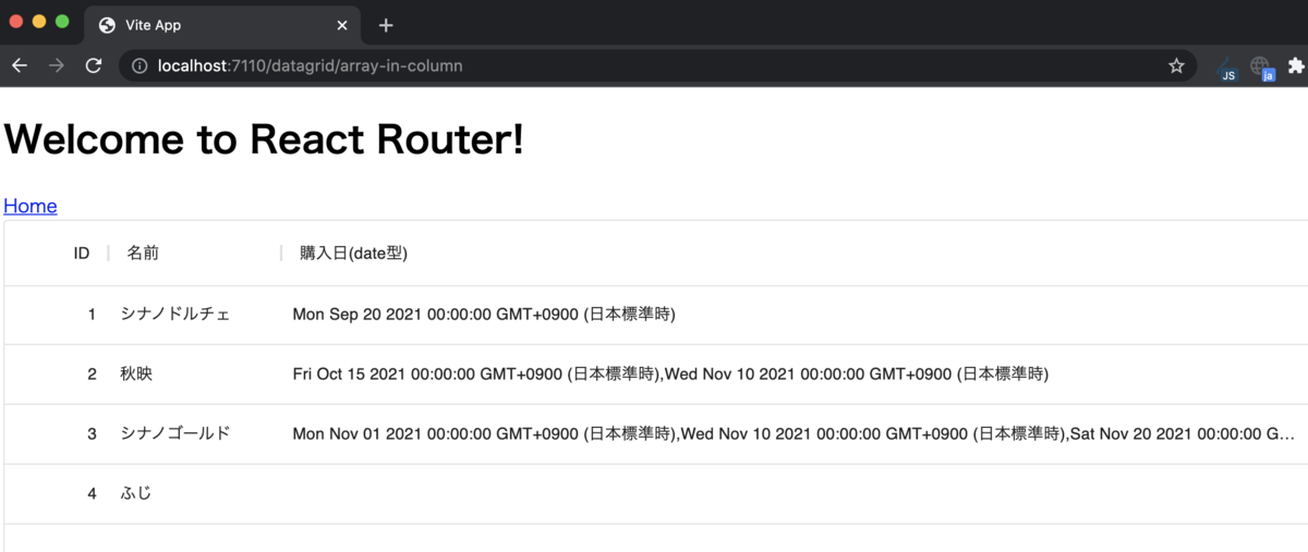
datetime型
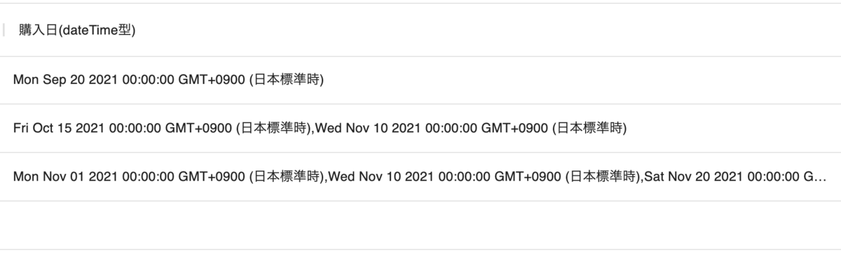
string型
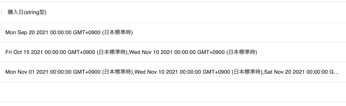
と、いずれもstring型として表示されました。
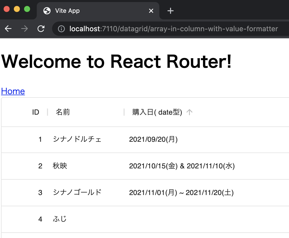
DataGridの valueFormatter と date-fns による書式設定
DataGridの Columns 設定によると、
The value formatter allows you to convert the value before displaying it
Value formatter にて表示書式を変更できるようです。
Value formatter - Data Grid - Columns - MUI
そこで、件数に応じて表示を変えるよう、書式を
- 1件
- 2021/11/07(日)
- 2件
- 2021/11/07(日)・2021/11/08(月)
- 3件以上
- 2021/11/07(日)〜2021/11/08(月)
としてみます。
また、今回は date-fns を使って書式を設定することとします。
date-fns - modern JavaScript date utility library
まず、date-fns をインストールします。
date-fns - modern JavaScript date utility library
% yarn add date-fns
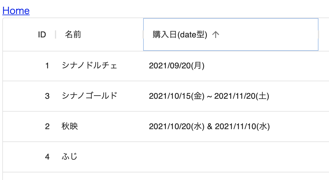
続いて DataGridArrayInColumnWithValueFormatter.tsx を作り、 valueFormatter 用の関数を用意します。
const lastDay = (days: (null | string)[]): string | null => {
  return days.slice(-1)[0]
}

const formatDays = (params: GridValueFormatterParams) => {
  if (!Array.isArray(params.value)) {
    return null
  }

  const formattedDays = params.value
    .filter((v) => v)
    .map((v) => {
      if (v === null) {
        return null
      }
      return format(v, 'yyyy/MM/dd(eee)', {locale: ja})
    })

  switch (formattedDays.length) {
    case 0:
      return ''
    case 1:
      return formattedDays[0]
    case 2:
      return `${formattedDays[0]} & ${formattedDays[1]}`
    default:
      return `${formattedDays[0]} ~ ${lastDay(formattedDays)}`
  }
}
最後に GridColDef の valueFormatter へ設定します。
const columns: GridColDef[] = [
  {field: 'id', headerName: 'ID', width: 90, type: 'number'},
  {field: 'name', headerName: '名前', width: 150, type: 'string'},
  {field: 'purchaseDate', headerName: '購入日( date型)', width: 900, type: 'date',
    valueFormatter: formatDays  // 追加
  }
]
表示すると、書式が設定されていました。
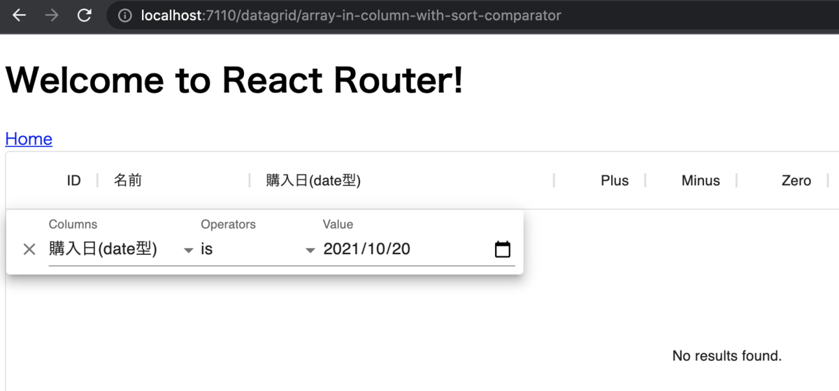
DataGridの sortComparator にてソート機能を設定
ここで、書式を設定したコンポーネントで昇順ソートを試すと、
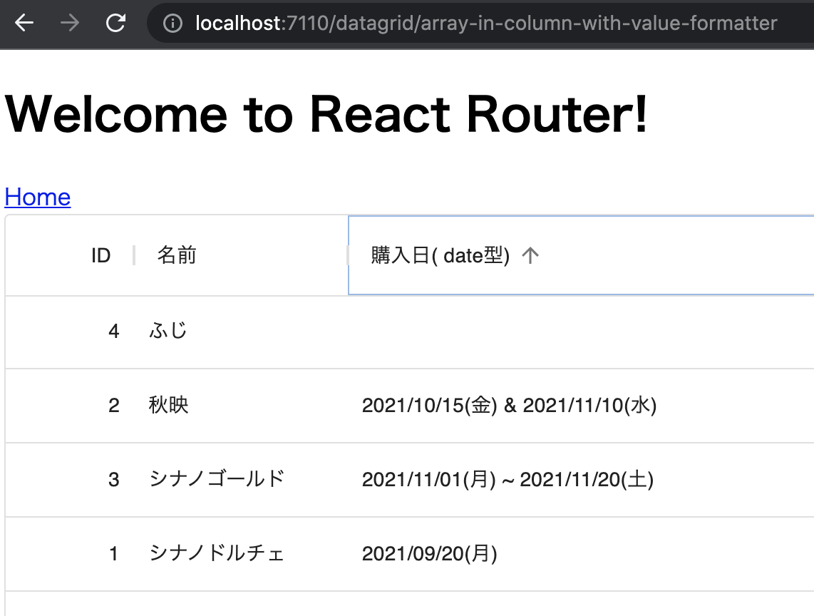
と、正しいソートとなっていませんでした。
正しくソートを設定するには Custom comparator を使えば良いようです。
Custom comparator - Data Grid - Sorting - MUI
Custom comparator の仕様確認
公式ドキュメントにあるソースコードより、Custom comparatorで返す値は
- 正
- 負
- 等しい
のいずれかを取れば良さそうでした。
ただ、どの値を返すのが良いのか分からなかったため、試してみることにします。
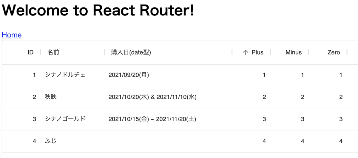
まずは
const compareReturnPlus = (v1: GridCellValue, v2: GridCellValue) => {
  console.log('=============>')
  console.log(v1)
  console.log(v2)
  console.log('<=============')
  return 1
}

const compareReturnMinus = (v1: GridCellValue, v2: GridCellValue) => {
  console.log('=============>')
  console.log(v1)
  console.log(v2)
  console.log('<=============')
  return -1
}

const compareReturnZero = (v1: GridCellValue, v2: GridCellValue) => {
  console.log('=============>')
  console.log(v1)
  console.log(v2)
  console.log('<=============')
  return 0
}
と、常に正・負・等しい値を返す各関数を用意します。
次に、GridColDefの sortComparator に
const columns: GridColDef[] = [
  // ...
  {field: 'plus', headerName: 'Plus', width: 90, type: 'number', sortComparator: compareReturnPlus},
  {field: 'minus', headerName: 'Minus', width: 90, type: 'number', sortComparator: compareReturnMinus},
  {field: 'zero', headerName: 'Zero', width: 90, type: 'number', sortComparator: compareReturnZero}
]
と、それぞれの関数を指定します。
最後にデータとして
const rows = [
  {
    id: 1,
    name: 'シナノドルチェ',
    purchaseDate: [new Date(2021, 8, 20)],
    plus: 1,
    minus: 1,
    zero: 1
  },
// ...
のように id 列と同じ値を plus ・ minus ・ zero として用意します。
画面で plus 列を昇順ソートしたところ、コンソールには
=============>
2
1
<=============
=============>
3
2
<=============
=============>
4
3
<=============
と出力されました。
画面は昇順でソートされています。
もう一度 plus 列をクリックしたところ降順でソートされました。

次に、minus列をクリックすると
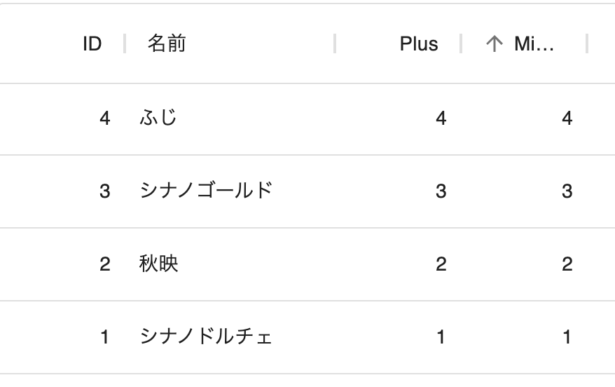
と、画面は昇順ソートされましたが、実際には降順でソートされました。
もう一度 minus 列をクリックしたところ昇順でソートされました。
なお、Consoleの出力値は plus 列のときと同様でした。
最後にzero列をクリックすると
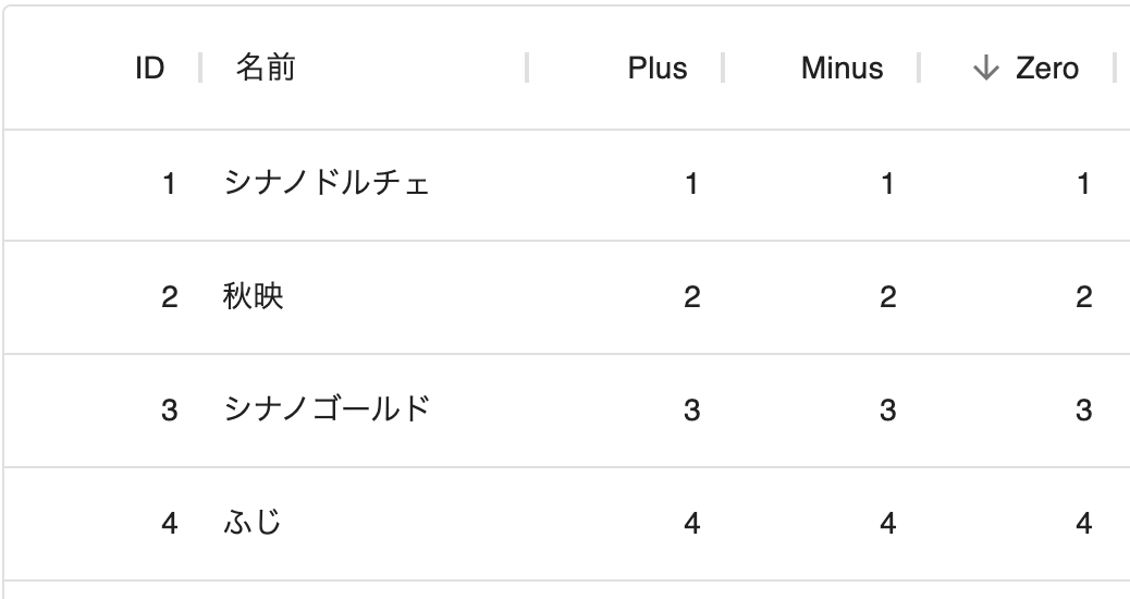
と、昇順・降順ともに変化はありませんでした。
これらより、
- Custom comparatorの第1引数には次の行、第2に引数には現在の行の値がそれぞれ渡されてくる
- Custom comparatorの第1引数の方が大きいときは正の値を、第2引数の方が大きいときは負の値を返せば良さそう
と考えて良さそうでした。
Custom comparator の実装
まずは今回使うコンポーネント DataGridArrayInColumnWithSortComparator.tsx に、Custom comparator用の関数を定義します。
今回は複数の日付のうち先頭の日付をソートの基準日とし、date-fns の differenceInSeconds で差分を取るようにします。
また、想定外の型が入っていたときは、ひとまず固定値を返しています。
const compareDays = (v1: GridCellValue, v2: GridCellValue) => {
  if (!Array.isArray(v1)) {
    return 1
  }
  if (!Array.isArray(v2)) {
    return -1
  }

  if (!(v1[0] instanceof Date)) {
    return 1
  }
  if (!(v2[0] instanceof Date)) {
    return -1
  }
  return differenceInSeconds(v1[0], v2[0])
}
続いて、 GridColDef の sortComparator に作成した関数を指定します。
const columns: GridColDef[] = [
  // ...
  {
    field: 'purchaseDate',
    headerName: '購入日(date型)',
    width: 900,
    type: 'date',
    valueFormatter: formatDays,
    sortComparator: compareDays  // 追加
  }
]
再度表示してみると
と、期待通りのソートとなりました。
DataGridのfilterModelとonFilterModelChangeにより、フィルタ機能を設定
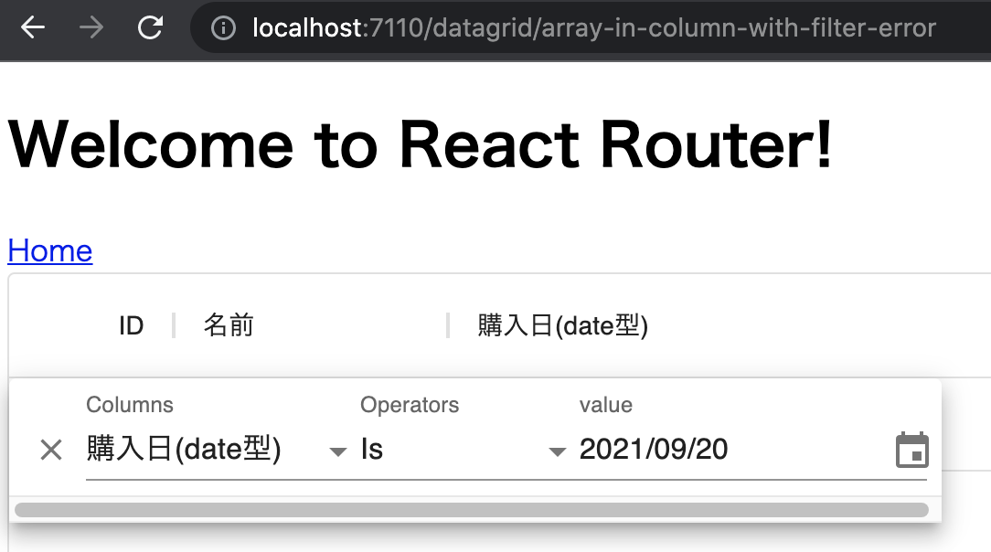
ソートができるようになったコンポーネントでフィルタの機能を使ったところ
と、 2021/10/20 のデータが存在するにも関わらず、1件もデータが表示されなくなりました。
Arrayなデータのせいか、フィルタがうまくできていないようです。
公式ドキュメントを見たところ、 Create a custom operator 機能を使うことで、独自のフィルタ機能を追加できそうでした。
Create a custom operator - Data Grid - Filtering - MUI
Create a custom operator を使うためには、 DataGrid に対して
- filterModel
- onFilterModelChange
を定義するとともに、新しく operator を用意してフィルタが必要な列の filterOperators に設定すれば良さそうでした。
今回は type が date の時のフィルタ機能を実装するため、既存の date 型の operator を見ると
- is
- is not
- is after
- is on or after
- is before
- is on or before
- is empty
- is not empty
がありました。
これらを実装してみます。
ただ、実装する中で失敗例と成功例があったため、それぞれメモを残しておきます。
[失敗] フィルタの入力値用コンポーネントを自作し operator で使う
まずは失敗例からです。
実装
最初に、一番簡単そうな is operator を公式ドキュメントのサンプルに従って実装してみます。
https://mui.com/components/data-grid/filtering/#create-a-custom-operator
まずは src/components/functions/datagrid/operatorsWithError.tsx に必要なものを実装していきます。
ここではMUIのDatePickerコンポーネントを使い、フィルタの入力値用コンポーネントを実装します。
const DateInputValue = (props: GridFilterInputValueProps) => {
  const {item, applyValue} = props

  const handleFilterChange = (event: any) => {
    // フィルタの入力値には時間が含まれるが、比較するときには時間が不要なため、削除しておく
    // すべて消すと event に null が入ってくる
    const value =
      event == null ? null : isValidDate(event) ? new Date(event.getFullYear(), event.getMonth(), event.getDate()) : ''
    applyValue({...item, value: value})
  }

  return (
    <LocalizationProvider dateAdapter={AdapterDateFns} locale={ja}>
      <DatePicker
        label="value"
        inputFormat="yyyy/MM/dd"
        mask="____/__/__"
        value={item.value}
        onChange={handleFilterChange}
        renderInput={(params: TextFieldProps) => {
          params.variant = 'standard'
          return <TextField {...params} />
        }}
      />
    </LocalizationProvider>
  )
}
続いて、フィルタの入力値用コンポーネントを指定した operator を用意します。
export const isOperator = {
  label: 'Is',
  value: 'is',
  getApplyFilterFn: (filterItem: GridFilterItem) => {
    if (!filterItem.columnField || !filterItem.value || !filterItem.operatorValue) {
      return null
    }

    return (params: any): boolean => {
      return params.value.filter((v: any) => isSameDay(v, filterItem.value)).length > 0
    }
  },
  InputComponent: DateInputValue,
  InputComponentProps: {type: 'date'}
}
これで operator 関係は実装できたため、DataGrid コンポーネント ( DataGridArrayInColumnWithFilterError.tsx ) に組み込みます。
なお、以下のコードでは示していない関数などは、ここまで作ってきたものと同様なので省略しています。
const Component = (): JSX.Element => {
  const [filterModel, setFilterModel] = React.useState<GridFilterModel>({
    items: [{columnField: 'purchaseDate', value: null, operatorValue: 'is'}]
  })

  if (columns.length > 0) {
    const ratingColumn = columns.find((col) => col.field === 'purchaseDate')
    const newRatingColumn = {
      ...ratingColumn!,
      filterOperators: [isOperator]
    }
    const ratingColIndex = columns.findIndex((col) => col.field === 'purchaseDate')
    columns[ratingColIndex] = newRatingColumn
  }

  return (
    <>
      <nav>
        <Link to="/">Home</Link>
      </nav>
      <div style={{height: 400, width: '100%'}}>
        <DataGrid
          rows={rows}
          columns={columns}
          filterModel={filterModel}
          onFilterModelChange={(model) => setFilterModel(model)}
        />
      </div>
    </>
  )
}
export default Component
動作確認
実行してみると、自作した operator が表示されました。
また、データの絞り込みも成功しているようです。
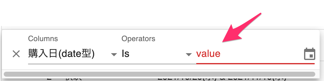
ただ、気になるところがいくつかあります。
まずは、DataGridの標準フィルタには存在しなかった、フィルタの下にスクロールバーが表示されています。
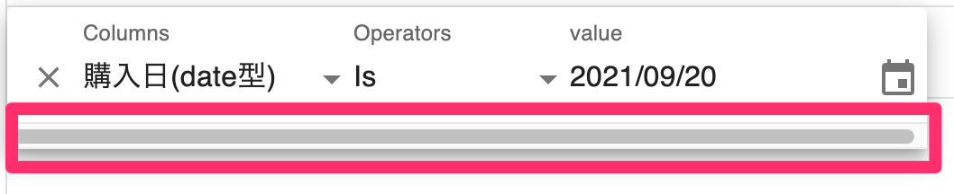
さらに厳しいのは、直接年月日を入力しようとしたところ、入力を受け付けずエラーになってしまうことです。
[成功] フィルタの入力値用コンポーネントとして標準の GridFilterInputValue を operator で使う
続いて成功例です。
DatePickerであっても、DataGrid標準の operator では動作していました。
そこで、DataGrid標準の operator を探したところ、以下にありました。
https://github.com/mui-org/material-ui-x/blob/v5.0.0-beta.7/packages/grid/modules/grid/models/colDef/gridDateOperators.ts
ソースコードの53行目あたりで、operator のコンポーネントに InputComponent: GridFilterInputValue と指定していました。
GridFilterInputValue の定義はこちらでした。
https://github.com/mui-org/material-ui-x/blob/v5.0.0-beta.7/packages/grid/modules/grid/components/panel/filterPanel/GridFilterInputValue.tsx#L34
そこで、 GridFilterInputValue を使い operator を作ってみたところ、うまくいきました。
実装
まずは、src/components/functions/datagrid/operators.tsx を用意し、 operator および operator で必要なコンポーネントを実装します。
なお、画面で入力したフィルタの値は 2021-11-08 のような - 区切りの書式で filterItem.value に設定されるため、実際の値と比較できるよう Date 型へと変換します。
const toFilterValue = (filterItem: GridFilterItem) => {
  // 日付は '-' 区切りの文字列で渡されてくるので、フィルタで使えるように整形
  const values = filterItem.value.split('-')
  return new Date(values[0], values[1] - 1, values[2])
}

export const isOperator = {
  label: 'is',
  value: 'is',
  getApplyFilterFn: (filterItem: GridFilterItem) => {
    if (!filterItem.columnField || !filterItem.value || !filterItem.operatorValue) {
      return null
    }

    return (params: GridCellParams): boolean => {
      if (!params.value || !Array.isArray(params.value)) {
        return false
      }

      return params.value.filter((v) => isSameDay(v, toFilterValue(filterItem))).length > 0
    }
  },
  InputComponent: GridFilterInputValue,
  InputComponentProps: {type: 'date'}
}
続いて、コンポーネント DataGridArrayInColumnWithFilter.tsx に、作成した operator を設定します。
先ほどの公式ドキュメント版では、コンポーネントの中で列定義を書き換えて operator を設定していました。
ただ、 GridColDef に filterOperators があるため、 GridColDef の方で設定します。
const columns: GridColDef[] = [
  // ...
  {
    field: 'purchaseDate',
    headerName: '購入日(date型)',
    // ...
    filterOperators: [
      isOperator,
    ]
  }
コンポーネントの方では operator の設定が不要となったため、スッキリしました。
const Component = (): JSX.Element => {
  const [filterModel, setFilterModel] = React.useState<GridFilterModel>({
    items: []
  })

  return (
    <>
      <nav>
        <Link to="/">Home</Link>
      </nav>
      <div style={{height: 400, width: '100%'}}>
        <DataGrid
          rows={rows}
          columns={columns}
          filterModel={filterModel}
          onFilterModelChange={(model) => setFilterModel(model)}
        />
      </div>
    </>
  )
}
export default Component
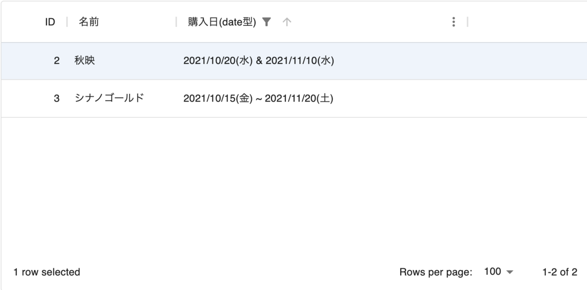
動作確認
フィルタを使ってみると、スクロールバーやエラーは表示されません。
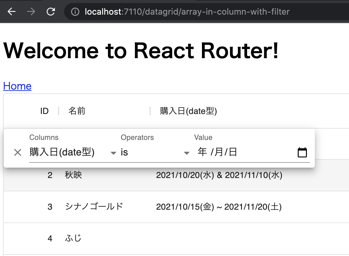
フィルタによる絞り込みも問題なくできました。
また、
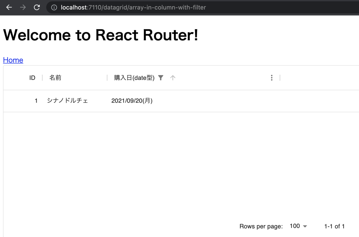
const rows = [
  {
    id: 1,
    name: 'シナノドルチェ',
    purchaseDate: [new Date(2021, 8, 20)]
  },
  {
    id: 2,
    name: '秋映',
    purchaseDate: [new Date(2021, 9, 20), new Date(2021, 10, 10)]
  },
  {
    id: 3,
    name: 'シナノゴールド',
    purchaseDate: [new Date(2021, 9, 15), new Date(2021, 10, 10), new Date(2021, 10, 20)]
  },
  {
    id: 4,
    name: 'ふじ',
    purchaseDate: [null]
  }
]
というデータに対し、 2021/11/10 と等しいものというフィルタ

を入力すると、正しく絞り込みが行われました。
あとは、date-fns の関数を使いながら他の operator も実装し、問題ないことを確認しました。
- https://date-fns.org/docs/isSameDay
- https://date-fns.org/docs/isAfter
- https://date-fns.org/docs/isBefore
ソースコード
Githubに上げました。
https://github.com/thinkAmi-sandbox/react_mui_with_vite-sample
今回のPRはこちらです。
https://github.com/thinkAmi-sandbox/react_mui_with_vite-sample/pull/1